Saturday 19 March 2011

Music magazine contents photo shoot


Photograph 1: This image was taken indoors when my sister arrived at the venue. I quite like this image as it allows the audience to see a close-up of her jewellery and makeup. However i'm not quite sure if i am goig to use it on my contents page as the flash of the camera seems to have had made everything look glossy and there also appears to be a shadow which looks unprofessional.

Photograph 2: This image is a mid shot of `Nicole Scherzinger` which allows the audience to see a bit more of her clothing as well as her jewellery and make-up. She appears to be posing for the camera by holding the scarf of her dress, which at the same time shows of her bangles.

Photograph 3: This image was taken from an angle in which only the right hand side of her face is visible, by doing this, it has given the image a more professional touch, and also makes readers want to see how she looks face to face. This close-up shot allows the reader to see her makeup.

Photograph 4: This image has been taken from an angle in which the camre is directly focussing on her face. She appears to be looking directly downwards, making her eye make-up stand out. Her jeweller is the main focus on this image. I wont be using thsi image as her facial expressions suggests that she is stress and worried.

Photograph 5: This image is my favourite one out of the others, as it looks quite elegant. This image was taken insde of the car before she arrived at the wedding centre. The shot looks quite professional, and i can see it being used on a contents page. This close-up shot allows the audience to see her jewellery, make-up and a small percentage of her clothing. I also like this image as it will make readers want to go and read the double page spread to see what her she looks like from a full length shot. Even though she is looking down, she has a smile on her face will suggests she is quite exctied, but at the same time a little but nervous. By having her eyes looks downwards, it allows the reeaders to really focus on her makeup, which is the main thing. So this is one of the images i am going to be using on my contents page


 Photgraph 1: I really like this image as it looks very misterious, making the target audience wanting to read on and find out more. This image of my friends will  act as a copy of Cheryl Cole, as she looks a lot like her. This image was taken in a phot studio where i was able to take images behind a wide range of backgrounds. I quite like this image as it has some attitude.

 Photograph 2: This image has been taken from a different angle which only shows the right hand side of her body. By having her hand positioned at the edge of her cheek shows some `sexyness`. From this shot we are able to see her jewellery. However i don't think this image is suitable for a contents page as it looks more geared towards a jewellery advertising company.


 Photograph 3: This image is a mid shot of `Keri Hilson`. She appears to have her hands going through her hair, making her look like life just cant get any better. Her clothing and jewellery can be seen clearly. However I won't be using this image as she doesnt look very happy.


Photgraph 4; This image has also been taken from the right hand side. I dont really like this image as there seems to be a lot going on at the same time, which will annoy any readers. She has her hand places next to her ears and you cant see her legs but they have been positined so that they are raised. Your can't see much of her face because of her hair and her hand. The image is also quite dark and shaodwy, which makes it look unprofessional. 


Wednesday 2 February 2011

Music magazine cover research


rapper drake vibe magazine Drake Makes Front Cover Of VIBE Magazine
This image taken from google is the front cover of Vibe magazine. The colours on this magazine have been used very cleverly. The main colours are yellow, white and balck, which represents power. Drakes top appears to be balck and the colour balck has been used quite a lot on this front cover, this gets the magazine front cover flowing smoothly. The colours yellow and black are used oftenly toegther as these are opposties and allows a strong contrast betweeen the tetxts, the yellow also helps to grab the readers attention and it appears to be popping out of the page.
The main object that the readers will see on this front cover is the artsies, Drake. A close-up shot has been taken of him which allows us to see his facial expressions. This allows the audience to see the artistst instantly, as he is the main focus. His facial expressions say a lot about the magazine without even having to read into it. He appears to have his head titlted and has a smirk on his face which shows that he is `chilled` and shows the `classy` side of him. This image is a great way of showing power and importance as he has been placed slap bang on the middle of the front cover, which shos hat he is the centre of attention. Drake also appears to be looking directly into the camera, this has been done so that, no matter what angle you look at him from, his eyes will be focused on you, this will make the readers feel as if they self concious and confused.
The masthead appears to be largest text on the page, this has innitially been done to grab the readers attention to the magazine. The amusic artist appears to be standing infront of the masthead which makes the mastehead harder to read, this usually shows how successfull that magazine company is that it can be recognised even with a few letters missing. The masthead has also been written in sans-serif, which tells us that it's an informal, chatty magazine that is aimed at a younger audience. 
All of the cover lines have been written in the same font as the masthead which helps the magazine flow together quite effectively. The cover lines also appear to be positioned either side of the artist. I think they have been placed very well and they don't interfere with the main image. The cover lines also appear to be in a range of different sizes. This has been done as the larger the font the more important the story will be, and vice versa.
This magazine lacks in conventions as it doesn't have any dates. However there is a barcode, positioned in the bottom left hand corner. There is also a website alongside with the barcode but it is quite difficult to make it out.


The image that has been taken for this magazine is a mid-shot of T.I, a well known music artist. This has been done to allow the readers to see what he is wearing. He appears to be wearing casual clothing which tells us that this magazine is going to be informal and have a chatty tone. The image appears to be positioned in the centre of the page so that it is  the first thing that the readers can see when they look at the magazine. The masthead seems to be placed behind T.I which suggests that he is superior, making him look like he's in charge. You can't see the letter `p` on the word `rap` as his head is covering it up, this tells us that this magazine is very well known and even if the masthead i difficult to read people will recognize it straight away as it is such a successful magazine. The masthead also appears to be in sans-serif which shows that this magazine again is going to be quite informal. I like the way the letter `U` on the magazine has been designed. It appears to look like and arrow pointing up, this goes very well with the word `up` makes the masthead look more fun. `Rap Up` also has been written in the largest font on the front cover, this is has been done to grab the readers attention to the name of the magazine. However This magazine lacks in key conventions. It doesn't have a barcode or a sell-line. I believe that the sell line is one of the most important features of any magazine as it is the one that will actually sell the magazine and make readers want to purchase it. The cover lines appear to be placed on either side of the main image and are kept well away from T.I. They have also been written in different fonts, the larger the front the more important that particular story will be and the smaller the font the less important the story will be. By looking at this cover we can see that T.I is going to be the main feature. The 3 main colours that have been used on this front cover are pink, black and white. This has been used throughout the whole of the front cover which allows the cover to flow smoothly. When i first looked at this magazine cover i was surprised to see the colour pink along with a male artist, i was expecting to see blue or maybe red. This colour has probably been used to show that this magazine isn't just aimed at males but its targeting females too.


This image is of the front cover of Billboard magazine. The main colours used on this front cover black and white. These two colours can never go wrong together. A close-up shot has been taken of Rihanna which fills up the whole front page. This has been done to allows readers to see her what she is wearing. Her body language looks as if shes daring people to read the magazine. She is looking directly into the camera, which means that whatever angle we look at her from, her eye will still continue to be focused on us. This will make readers feel nervous. She appears to be wearing a a mini dress, this suggests that she's not just any women, she looks very dangerous and that she wants her own way wherever she goes. Yet again the masthead has been placed behind her which shows that she has more power. The letters `B` and `D` appear to be coloured in red and green and Rihannas face has been placed in between these two coloured in letters. I think that this looks like a set of traffic lights, the red representing stop and Rihannas head representing get ready (amber), this tells us that this magazine is probably bursting with news about Rihanna, so it's warning readers to get ready for a rollercoaster ride. In most cases the masthead appears to be in the largest font, but by looking at this Billboard magazine it looks as if this has been done the opposite way round. Riahnnas name that has been placed on the bottom of the page appears ot be in a much alrger font in comparison with the masthead. This has most likely been done to show that she is more superior in this case. The word `Riahnna` appears to be streched accross the front cover, this tells us that she is never ending and we will continue to hear about her and her career. The cover lines have been placed on the left hand side of this magazine, keeping them well away from the main image. The coverline titles have been written in a black fotn but have also been highlighted in white. This has been done to help grab the readers attention. By highlighting the it helps them  to stand out on the dark background. This magazine cover does not have a sell line, however there has been a quote placed below Rihannas name which says; "My fans don't really knwo who is am". This has been written in capital letters whcih suggests that its quite important. The quite is more like a cliffhanger, in which the only way they will fond out who the real Rihanna is, is to buy a copy of this magazine.

   
The name of the magazine has been wrtitten in a very unique style compared to other magazines. The `Q` is very different but very effective. In the case of this cover there is just one single image of the artist Madonna. The close up Shot fills the whole magazine front cover, with the artist making full eye contact with the purchaser. Her facial expressions allows is very important as this is what is seen by everyone, her expressions suggest that there is another side to her, but you will  only find out if you read the mazgine itself, so it is a good way of persuading perople to buy the magazine.
 This magazine uses many cover lines, which are spaced out around the main image, making sure it does not draw its attention from the main shot. The cover lines are in either white or red, the same as the colour of the mast head, this allows a sense of flow. The colours stand out and helps to grab the readers attention and it also gives it  a fresh bold look as the background is very dark. The main cover line, takes up to a quarter of the front cover. This Q magzine uses two font sizes to create there main coverline, using the largest font for the Madonnnas name as it is the most important feature of the magazine. The size in which they use there main cover line attracts the audience because they are bold, the main cover line appeals to the audience through the use of sans serif, it creates a professional look to the witting and keeps it informal.
The sell line is the one of the most important features of any magazine as it is one of the ways to try and sell any magazine. Q's sell line is `Britains biggest music magazine` this will make anyone want to buy it and find out for themselves how big it really is.
Other conventions include a barcode, this is situated in the top right hand corner, which is easy to find and not stuck down in the bottom right like other magazines normally place them.
There is a freebie inside of the magazine which helps to sell the magazine as most of the time people believe that they are getting their money's worth by paying for one magazine but they actually get two.


Music magazine contents page research

This is an example of the contents page in Q magazine. The Q logo is right at the top of the page to show the brand along with the issue, Ocotber 2008. The letter `Q` has been written in the same size font as the word `contents` this allows a sense of flow and continuity throughout the contents page.
This magazine is aimed at males aged 18+, this is because they are the type of people usually interested in the genre of music this magazine is aimed at. Also the magazine seems to be quite serious rather than playful as it would be if it were aimed at a younger audience.
The ideology behind this magazine is to promote pop, rock and indie music. This is shown by the variety of bands that are featured within the magazine and within different articles.
The main image on this page is of The Courteeners.  The Courteeners are a relatively new band and Q focuses on old and new music. The image is a full shot of them and taken up half the size of the contents page. This has been done to allows the readers to see what they are wearing, and the size will help to grab their attention to the contents. From what they appear to be wearing it tells the reader that they are quite a new band.
 They have seperated the features only in this month's magazine and features that are included every month. This is good for the reader as it helps them to find out what is included within the magazine fairly easily. The page number appear to be written in red and the description of whats included on that page has been wirtten in a black font. These two colours are very effective and work together really well. The red enabled the page numbers to stand out and make it easier for the reader to find what they are looking for.
The contents page is simple and the presntation of it is really good. It is easy to read and the colour scheme fits in with the magazine's masthead, allowing the whole magazine flow nicely.

The text on this contents page appear to have been written in a mixture of sans-serif and serif, which suggests that this magazine is formal aswell as informal.
This magazine also has a its very won website, this is really good as people who are unable to go to the shops and buy a magazine will be able to have access to it through the internet. 

 This magazine content page is from the vibe magazine which is manly a urban type music such as r&b and hop hop. I really like this contents page, its one of  my favorite ones so far. I think the picture makes the page look really modern and interesting, the pose is unique so this contents page would stand out from others, the shot that it has been taken from allows us to see what she is wearing from head to toe. This image also fill up the whole page, this has been done to grab the readers attention staright to the artist. she appears to have her legs raised in the air in the shape of the letter V. This is quite cleverly done as the name of the magazine starts with this letter too.
The top she is wearing is the same colour as the background, this allows the whole page to flow smoothly. From researching contents pages of music magazines i have learnt that again the picture seems like the most important feature of the page, then the text. From what she is wearing (clothing and jewellery) you can see staright away that she has a very unique way of presenting herself to the public. She is posing for the camera in a different and chic way, which suggests that the magazine is cool and classy.
I like the way the page is  split into two subheading; “Features” and “Fashion” , it makes it easier for the reader to find what they are looking for.
The colours used on this contents page are all very rich and elegant, which straight away tell is that this is going to be an expensive magazine, full of hot gossip.
The word `contents` appears to have been written in capital letter and in a white font. This helps it to stand out against the dark background. It immediately grabs the readers attention. I'm not quite sure as to why the word contents has been typed out in 3 steps. This has probably been done so that it does not interfere with the main image, and so that all the text is kept to the right hand side of the page.
All of the text on this page has been written out in sans-serif which suggests that this magazine will be an informal and chatty magazine.
  
This magazine contents page appears to look very well organised and layed out. You can tell that a lot of work and effort has been put into making this contents page. The main colours used are red black and yellow which represent death/danger. This reflects the type of music as rock bands usually sound quite dangerous. The images are all of a rock band. They all seem to have a number next to them which makes it fairly easy for readers to find the page numbers. The main imge on the page has been made a bigger size in comparison to the others. The photo also appears to be in black and white  which is most likely to be done to show that this band is quite old.
All of the page numbers and features have been writtenon the left hand side of the cover. The page numbers appear to be typed out in red, whereas the description of what the page includes has been written in black. These colours both work together very well.
The word `contents` appears to be in a vey large front, this has been done to grab the readers attention.
The name of the magzine `Drummer` has been written in capital letter.  `Drummer` looks like it has been written in the largest font on the contents page. This has been dont to make it stand out and it also helps the nasthead to lift it off the page. The two `M's` from the word drummer have been merged into one, buy doing this it now looks like a heartbeat. This links to the idea of the dumbeat acting as your heartbeat, that is probably the reasing for this merging.
The word `exclusive` looks like it has been stamped on the page. The stamp has been blended really well from the white space next to the page features into the image of the man on the drums. I think this helps the magazine to flow smoothly.
The dominant colours used on this contents page are black, red and white. These colours represent fear and dager which reflect the band. If the colout pink/blue/green were used, it wouldn't of had looked as good as the colours used now. The red really lifts of the page and stands out really well against the black and white background. The magazine will be targetted at male drum band fans aged 20+, by this age men are agressive so these colours used on this contents page also reflect their personalities.


Music magazine double-page article research


I really like this double page spread, it has been layed out and presented differently which makes it look unique. The full shot of the artist allows the readers to see how she is dressed. She appears to look very well groomed and is wearing a mini red dress which suggests that she is a very fashionable person. The way her legs have been postioned tells the audience that she is very young and flexible.  She has been positioned to the right hand side of the page breaking the text into two, this helps to reduce the proportion of the text and helps the reader to dijest the information a little at a time. at the top of the page there are a couple of different shots of her that have been taken in different angles, its looks like she is dancing, so straight away by looking at these images this tells the reader that she is a dancer. These images have been minipulated and are in black and white. Im not quite sure as to why the images have been made black and white, but i think it looks quite good how it flows with the text and allows a sense of continuity. The artist is the only object ont he page which is in colour, this makes her stand out from the text and lifts her of the page.
The main sub-heading before the text starts has been written in quite a large font. It's the largest font on the page which suggests that its the main and most important part of the artible. The article has written in is Times New Roman. This is a serif font, this is quite a traditional style of writing and suggests that this is quite formal.
 However on the first line of the article, there is the use of the bold sans serif font. This tells us that this piece of text is going to be informal. Both of these fonts contrast each other. This has probably done to show both formal and informal sides of the text, making all readers wanting to read the article.
There are five black lines that have been stretched accross the two pages. This has been done to divide the black and white images with the text, this helps to make the article look oragaised and less cluttered.


This is a double page spread of a music magazine. It is very unique in the way it has been presented and layed out. The two pages flow together really well without any clashes. I like the way in which the image on the Right hand side is a mid shot which that allows the audience to see what she is waering from her head to knees. The way she is posing for the camera is very stylish, this suggests that she is a quite posh and enjoys what she is doing. She is sitting on the side of a bed and her body language tells us that she has just got up from bed and up and ready for a busy day. There is another image of her on the top left hand side of the page. However, this image is a mid shot and only fills up half of the page. The image appears to be in black and white which, which contrasts with the coloured image and text quite well. If this image was in colour it wouldn't of has stood out and grabbed the readers attention aswell as it has now.
The name of the artists `Jamelia` appears to be written in the largest font on that page, this has been done to grab the readers attention, and pull them towards the article. The letters appear to be transparent, which means that the image of the artists in the background is visible withing the word `Jamelia`, but they appear in colour which makes the name of the artists stand out really well. The colours that appear through the transparent text have been edited so that they look bolder and more colourfull. Even though the letters are transparent, it gives the word a patterend and textured look.
This double [page spread is divided into quesitons and answers... basically and interview of Jamelia. The quesitons have been written in red and her responses have been written out in white. These two colours are used throughout the whole article and this allows the two pages to flow together smoothly. Both of these colours have been taken from the clothing the she appears to be waering on the images. The main image part of the article has been placed in the middle of the two pages, which helps the two pages to fit together and let the article flow. This part of the article has been written in a slightly larger font in comparison with the other text on the page. This has been done so that it stand out from the page.
The main heading of the page has been placed on the top of the page. It has been written in a white font in cpaital letters so that it grabs the readers attention. The white text goes quite well against the black background.
All the of the text on this page has been typed out in sans-serif which suggsts that this is an informal and chatty article.


There is one image on this double page spread which takes up 3/4 of the page. The image has been positioned on the left side of the spread, also taking up part of the right hand page. Because of the size of the image and the fact that there is only one person, makes it clear that the article is about Florence.
There are three columns of text. They are all different sizes due to where they are so that they fit on the page, and not cramped together. None of the columns of text are that long, nor wide, instead, they are smaller which puts emphasis on the main image, which grabs the readers attention.
The  colour scheme used is white, black, grey and red. The colours put together give the double page spread a classy and cool look and feel. They also go well together which makes the page look quite stylish. There has been extra text added into the background, ‘USA’, which makes the spread look more interesting.
The main headline reads ‘got the love’, as any reader who knows of Florence and the Machine, knows that ‘Got the Love’ is a title of one of her most well known songs. It’s in an italic and sans-serif font style which is different from the rest of the text on the page, this helps the name of the article stand out and lift off the page.  Although it is in black, like most of the text on the page, it stands out more because of the different font and its larger size. The largest text on the page is behind the main image in the background, which is in a grey colour and reads ‘USA’. Although it is the largest text on the page, it doesn’t appear to be of the most importance, as other text stands out more.
The page looks very artistic from the way that the different features are laid out. There is lots of layering and various interesting fonts as well as a contemporary colour scheme. All of the different elements have been laid out cleverly to make the page look interesting, making the reader want to read more and more.
All of the text on this page appears to be on the right hand side, and the fact that the text hasn’t been interrupted, suggests that it is aimed at a more mature and older audience.
The way in which the photograph of Florence has been taken is very unique, with a simple and plain white background makes everything on the page stand out.
The background of the image is white, which completely contrasts to the artists’ black and edgy costume and make the artist stand out more, emphasising that the article is about her. The artists’ expression is also quite aggressive, which relates to her costume.

I quite like how the artists are all in very similar clothing, within similar shades of colours. This is emphasised throughout the page by the way in which the colours used are of the same font colours used, I like this feature as it helps add connection, it also allows the page to flow smoothly. The next feature that I noticed is how, three members of the band have had their transparency in the image changed so that they don’t stand out as much, whereas one of the men has been made slightly brighter and less transparent; this suggests to the audience that he may be the main focus of the feature. I also noticed that he is the only member in a different colour of clothing, for example the three members at the back are all dressed in grey, black and white colours which match the majority of the texts amongst the page whereas, the artist on his own is dressed in gold which is only used once within the text. This text states ‘Will he’, this suggests to the reader that this may be written about him as it shows a link between the two in terms of colour and shading, as they both stand out from the rest of the uniformed colours.
There aren’t any bright and over powering colours used. This helps create a cool impression as bright colours suggest fun and child like excitement, this also suggests that this band is very serious. so by using less powerful colours tell us that this article is aimed at older teenagers.
 I also like the use of the black highlighted text, this is because it suggests importance as it is brought away from the rest of the text suggesting that it is an important bit of information that needs to be read immediately by the audience. Regarding the text, I also like how the questions are written in a slightly bolder text than the answers, this helps break up the text and makes it a lot clearer for the audience to read.
The text appears to be placed to the left hand side and the image is places on the right.  this has been done so that the text doesn't interfere with the image.  I also like how the photograph has been placed across one page and then a little over the next, this helps the two pages to connect quite nicely.

Target audience research


To create a sucessfull music magazine i have created a quesitonnaire that i handed out to 20 random people between the ages 16-20 year olds, as this age group was my target audience. This helped me to get some background information on what peopple expect to see in my music magazine, so that it will appeal to them.


I handed out 20 of my questionnaires and have collected the results to give some fairly definite decisions on some features of my magazine. They are as follows;

From the results, you can see that RnB and hip hop were the most popular ones. so when it comes to designing my magazine i will have to consider this. I am very pleased with the results for this question as i wanted to feature this type of music.

This question allowed me to get some audience feedback on what colors they expect to see in music magazines. no-one picked black and white, which means that when i come to designing my magazine i will have to try and avoid black and white. however the majority of the people asked preferred bright colors. This result wont affect what i was originally was planning to do as this was what i had in mind. 


I randomly selected 3 possible names for my magazine and i let my target audience to chose as this would purchased by them. The most popular name was Beatz, with 12/20 people choosing this as the masthead of the magazine. i am very pleased with the result as this was my favorite name out of the others, as this suited the RnB and hop hop theme for my magazine. 

This fourth question was asking about how the image on the front cover of the magazine should appear . 12 people thought that the artist should be looking directly into the camera lens so that when the magazine is published and printed no matter where you look at the person on the page, their eye contact will re-main focused on you. so i will have to consider this when it comes to taking photos for my front cover.
I let my target audience to choose who they want to see on the front page of  my magazine. By looking at the results you can see that 9 people chose to see a solo female artist. I was already considering on using a female artist as i think they look quite nice on the front page with their `cheeky` attitude showing. I wouldn't of had been bothered if the solo male artist was the most popular one but if groups were popular then i would of had to consider to look elsewhere as this would be a hassle in doing and fitting people on the page. I still haven't come across a RnB music magazine that has a group on the front cover, which is slightly unusual. 

This question was asked to that i could get an idea of what type of shot should be taken of the main image on the front cover.  From the results i can conclude that midshot was chosen by the majority of thepeople asked closely followed by a full length. So this means that when it comes to designing my magazine frontcover i will have to use a mid shot of a solo female artist.

This quesition is about the image colour. This is the most importnat feature of any magazine. without images the magazine will look lifeless. From the results i can say that 12 people selected images to appear in full colour. This is the result i was expecting as most RnB and Hip Hop magazines only use full colour, you dont expect to see any black and white images unless it was a jazz/rock magazine.


From this quesiton i will be able to present and lay out my magazine contents  page so that it attracts/suits the target audience. From the results image on one side and the contents to be placed on the other. This is how i was origionally planning on on laying out my contents page. `Images and text mixed together` was the unpoular. This is probably because this page is important as its the one followed by the front cover, so that it has to looks good and doesnt put people off staright away. Having images and text mixed together will cause confusion.

This question is about my double page spread and how the image and the text should appear on the page. From the results i can say that 13 people chose that they wanted to see the image to stand out from the text. This will be hard in doind as i will have to edit the image so that its highlighted and looks like it is popping out of the page.
 

Music magazine cover planning


Before i even start to think about producing my music magazine front cover i went through a stage called planning, this anabled me to throw random ideas that i had in mind on to paper and think about my design carefully. So what i did was i divided an A4 piece of paper into quaters, this allowed me to come up with 4 totally different magazine front cover layout, as shows above. All of the sketches above have similar conventions of a magazine but have been arranged quite differently.
 My first draft is on the top left hand side of the paper. I'm not really a fond of this layout as it looks disorganised, by having the masthead on one side of the cover and the date on the other. The image will appear on the right hand side so that there is no disruption caused. There will be 3 cover lines kept away from the image so that it doesn't interfere with the image.  This cover appears to look very spacious and there's no flow, maing the page look lifeless and boring. But by having the masthead across the top of the page in a fairly large font will help to attract the readers attention. 
 My second draft is on the top right hand corner, i quite like this one as it it layed out like every music magazine. The cover lines are spread around and on top of the image allowing a sense of conctinuity and rhythm to the page. The cover lines will also overlap with the image, so this gives the front cover a professional look. The masthead will be placed accross the top of the page making it grab the readers attention as it will be written in a large and bold font. There will also be an advertisement slanted on the bottom of the front cover, this will make people want to purchase the magazine and find out more about the advertisement inside the magazine.
My third draft is on the bottom left hand side. This cover has been planned out quite differently to the other two, as the masthead appears to be written along the left hand side of the page, which i think makes the cover look like its had no thought or care put ino its design. The cover lines will appear to be slanted downwards, which in my opinion i believe it will make the reader will be annoyed as they will have to tilt their heads in order to read what it says. However, i really like how different this magazine cover is drafted out, its quite unique.
 My final front cover draft is on the bottom right hand side. This is quite similar to my first draft, apart from the fact that there will be an advert placed on the bottom of the page in a circular shape. By having a circular shape this makes the advert more appealing to the target audience. The layout it alright but i still think my second draft is a lot better as it looks more professional and sophisticated.
in conclusion,  when i come to designing my front cover, i will try and make it look like my second draft, as the design will suit the purpose of the magazine.


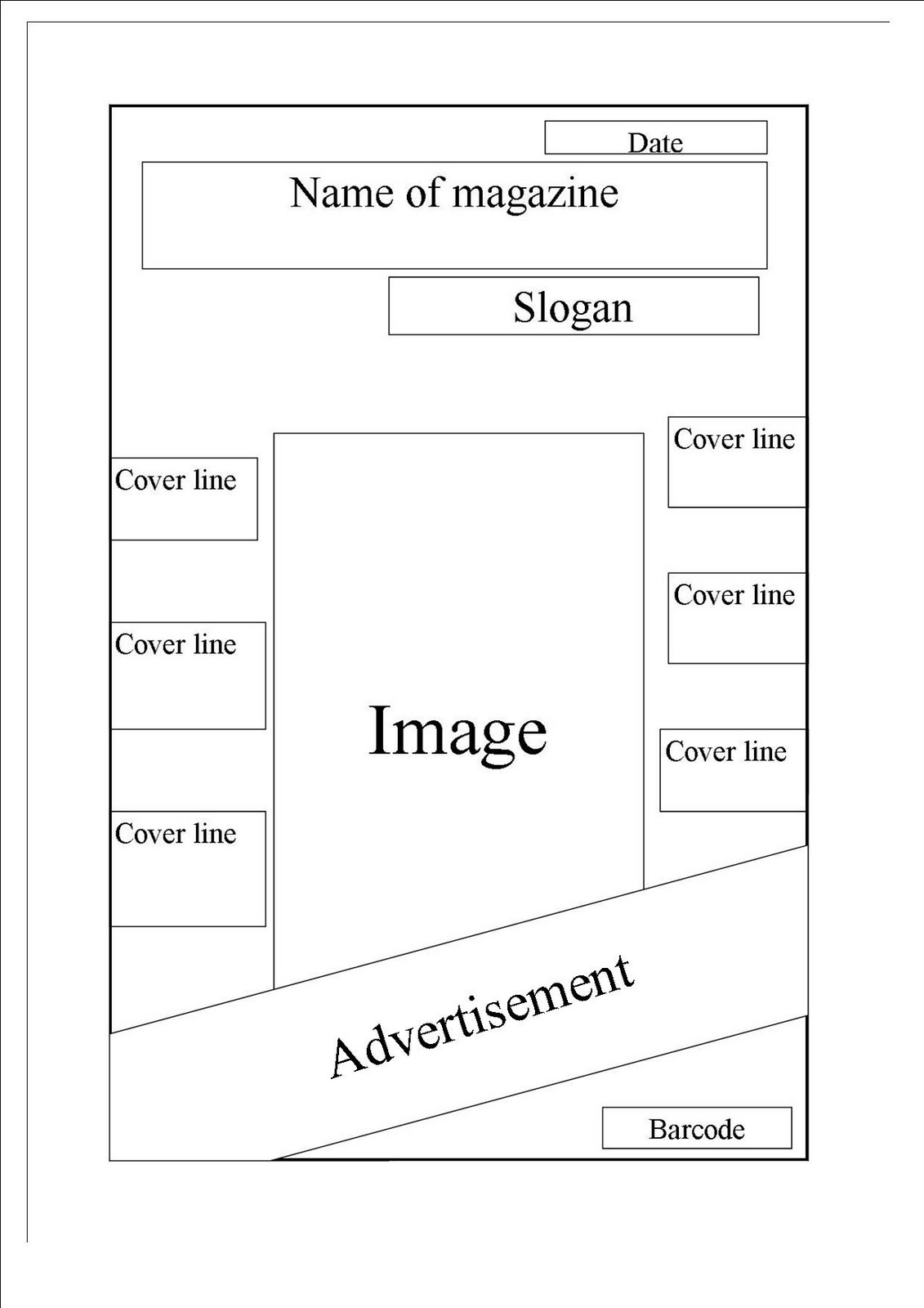
This is a computerised draft of how the layout of my features on the front page of the magazine will appear.
 

whilst i was producing my my music magazine front cover i had to change the position of the date and the slogan, so it would fit on the page and still look as good as my origional plan. The slogan now appears above the masthead, this gives it more of a proffesional look, whereas before it would of had been squashed below the masthead. The date now lying just below the letter `Z` of the name of the magazine.  

Sell line ideas:
1) The best selling music magazine- this sell line is simple and to the point, but also a little boring. 
2) The UK's best selling monthly music magazine- i like this one as it gives more detail by saying its the best magazine in the `UK`, so that it will make people want to buy it. 
3) The one a only..... - this sell line is quite cheesy and suits a beauty product advertisement that a music magazine.sell line. 


Music magazine contents page planning


Before i start thinking about designing and planning my contents page i created 4 drafts of possible ideas of what my contents page could look like. I tried to create 4 completely different drafts so that i could test and try a wide variety of layouts and find out which one would suit my magazine.
My first draft of my magazine contents page is situated on the left hand side of the page. This contents page is quite unique in the way it is layed out. The date will appear in the left hand corner in quite a large font, so that it will keep the resder aware of the date. The name of the magazine will appear across the top of the page in a clear, bold, and a sans serif font. This is because my magazine will eb quite informal and chatty. The font of my magazine will reflect the tone and register of the magazine itself.  An image of an artists will appear on the left had side of the page, with the contents on the right hand side. I really like the way this contents page is presented as it looks very organised.
My second draft is on the top right hand side of the page. The word `contents` will appear to be written across the top of the page in a large font so that readers are aware of the fact that this is the contents page. The date will be placed on the right hand side of the title of the page, but will appear in a much smaller font as this is less inportant. There will be two images on this contents page arranged on either side of the contents. The contents will be divided into two sections; one that will be music and another one that will be features. The page titles and number will appear to be slanted, this will make the page look quite different and will help the text to flow. However, i think that this makes the page look quite childish. Also to add to the negative side of this, readers will find it difficult to read the contents page and will have to titl their heads in order to read what it says. But other than that i think this is quite a different layout, which  people wouldn't expect to see.
My third contents page draft is on the bottom left hand side of the page. This appears to look quite similar to normal everyday music magazines. The name of the magazine will appear to be written alongside with the word `contents`. This will help the reader to know what magazine contents page they are reading and this also allows a sense of continuity. The page numbers and features will appear to be written on the left hand side of the page, in a block form. This will make the text look organised and kept away from the image which will be placed on the opposite side, so that there is no distraction caused. The date has been positioned at the top of the page, making it easier for readers to know what date it is. I don't really like this cover as it looks like what you would normally see on a music magazine contents page... i want readers to discover something new, which will want them to read on.
My fourth contents page is on the bottom right hand side of the page. This draft is the most unusual out of the others, this is why i like this the most out of the others. The name of the magazine (BEATZ) will be written across the top half of the page, this has been done to attract the readers to this. The text will have a white outline and it will be filled in the same colour as the background so that it flows smoothly with the page. The text will appear to be in a bubble type of font. `Contents` will be written just below the name of the magazine so that it directs the readers staright away after reading the masthead. The image will be on the left hand side of the page and will probably overlap the mastehad. This will help the page to flow and look quite professional. The contents will be placed on the right hand side of the page and will be divided into two sections. One which will say `Features` and another one that says `+plus`. Under the plus section things like freebies and upcoming tours etc. will be placed below this heading. By creating this section it will make readers want to read on and find out more.
Overall i have analysed all four of my contents pages and i have come up with the decision that i want draft number four to be the template of my contents page. As this looks professional and different.
This is a computerised version of my chosen draft for my contents page.


Music magazine double-page article planning


Here are a few sketches of possibilities of what my double page spread could look like. I have tried to make four completely diffderent layouts, as this would give me the opportunity to test out a wide range of layouts.


My first double page spread is situated on the top left hand side of the page. I have come accross this layout when doing my music magazine research. This is quite origional, but simple. The title of the double page spread will appear in the top left hand corner, kept well away from the images and text, as this will the page to look quite organised and wont distract the reader. The title will be in a large bold font, as this will help to grab the readers attention and pull them towards the page.
Two images will appear on the left hand side. I have decided to do this as, i believe that this makes the page look more eye catching.
The text will appear on the right hand side of the image in columns. This will allow the images to contrast with the text, making the page feel sophisticated. 
The advantages of this double page spread is that is looks well planned out and organised. However, this draft does also carry some disadvantages, such as: it looks quite boring and the page altogether has no sense of flow and rhythm.


My second double page spread is placed on the top, right hand side of the page. I quite like this one as it looks proffessionally layed out. The title of the article will be placed accross the top of the page. This will make it stand out and it will help the reader to get a taste of what this article could contain. The text will be in the largest font on the page, as this is the most important feature.
The two columns of texts will be surrounded by an image on each side. This allows a sense of continuity to the page and helps the reader to dijest the information, quite easily. If i placed an image then a text then another image, this would distract the readers, and will also cause confusion. From my target audience research, the majority of the people asked preffered if the image on the double page spread could stand out from the page, but in this case i wont be choosing this draft to develop as it doesnt meet my target audiences choice, and they will be the ones reading it, so i will have to make it appealing to them.


My third double page spread is on the bottom left hand side of the page. By looking at this darft you can staright away tell that it looks quite professional and that i ahev made a lot of use of the white spaces. This darft is quite different to all the others as a title wont appear on the top of the double page spread, however a border of image will. This will allow the two pages to tie together quite nicely, setting an atmosphere to the page. In my music magazine double page research, there was an article which had a border of image accross the top of the two pages, i thought this looked quite good, making the page looks elegant.
The title of the page will appear just below the border of images, and kept towards the left hand side, this is so that readers don't feel like there is too much going on, on the page at the same time.
A column of text will be placed on the left hand side of the page. Then next to the column on the opposite side, there will appear a small column of text that haas been taken from the atricle and written out in a bold font. This helps the page looks more proffessionl. By having this block of text in bold, the readers will staright away assume that it's quite important as it appears to lift of the page.
An image will be put right in the middle of the two pages which will help the page to flow evenly. If i decided to place text in between the break of the two pages, this would make it a lot harder for the readers to read what it says, so by keeping an image, it won't be so hard to make out what the `item` is.
On the right hand side of the image, there will be another block of text. This helps to complete the page and leaves the article in much more of a serious tone.
Overall, i think that my third darft looks very professional, however i think that there is a lot going on at the same time, which in my opinion, makes the page look childish.


Finally, my fourth double page spread appears to be on the bottom right hand side of the page. I believe that this draft is the best in comparison with the others as, there is just enough information required and doesn't looks majory distracting.
The title of the article will be placed more on the right/middle of the page. This has been done so that the image that will appear on the left hand side will take up just less that 1/2 of the page. This image will be a full-shot so that readers will be able to visually see what the actor/actress/band/artist are wearing. The first few letters of the title will most likely to be touching the head of the person on the image. This will make the mage look very professional as a lot a magazine companies, like overlapping of words on images, so this is something that i would like to take on board.
All the text will be placed on the right hand side of the image and on the second page. This will help to divide the image and the title from the text. Inbetween the texts there will be a block of the text taken from the article and written out in bold. This will show the imaportance of a certian part of the article.
I am going to go with this draft as my final layout for my double page spread as i think it looks more appealing. And also when i was doing my target audience research, the majority of the people surveyed, thought that the image should stand out from the text, so this is exactly what this draft is doing, allowing the image to pull out from the page amongst the text. Whereas the images on the other three drafts don't seem to grab the readers attention, as they are blended in with the texts.


This is a computerised version of how i present my double page spread.